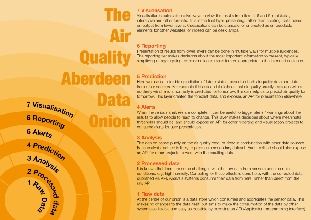
The Air Quality Aberdeen Data Onion is a diagram that models the overall system that will ultimately drive reports and visualisations from the Air Aberdeen project.
It is easy to visualise the raw data from a sensor. You just pick a colour scale, or a gauge widget, and let javascript work some magic. This quick and easy approach can miss a huge opportunity to improve both the data and the interpretation that is presented to the public.
Building up from the raw sensor data, each layer in the onion adds value in some way. By fixing possible errors with the data, by making the data easier to work with, or by presenting information in a digestible manner.
All of the projects at Air Quality hack weekends live in one or other of these layers of the onion – or in the interface between layers.
7 Visualisation
Visualisation creates alternative ways to view the results from tiers 4, 5 and 6 in pictorial, interactive and other formats. This is the final layer, presenting, rather than creating, data based on output from lower layers. Visualisations can be standalone, or created as embeddable elements for other websites, or indeed can be desk lamps.
6 Reporting
Presentation of results from lower layers can be done in multiple ways for multiple audiences. The reporting tier makes decisions about the most important information to present, typically simplifying or aggregating the information to make it more appropriate to the intended audience.
5 Prediction
Here we use data to drive prediction of future states, based on both air quality data and data from other sources. For example if historical data tells us that air quality usually improves with a northerly wind, and a northerly is predicted for tomorrow, this can help us to predict air quality for tomorrow. This layer created the forecast data, and exposes an API for presentation elsewhere.
4 Alerts
When the various analyses are complete, it can be useful to trigger alerts / warnings about the results to allow people to react to change. This layer makes decisions about where meaningful thresholds should be, and should expose an API for other reporting and visualisation projects to consume alerts for user presentation.
3 Analysis
This can be based purely on the air quality data, or done in combination with other data sources. Each analysis method is likely to produce a secondary dataset. Each method should also expose an API for other projects to work with the resulting data.
2 Processed data
It is known that there are some challenges with the raw data from sensors under certain conditions, e.g. high humidity. Correcting for these effects is done here, with the corrected data published via API. Analysis systems consume their data from here, rather than direct from the raw API.
1 Raw data
At the centre of our onion is a data store which consumes and aggregates the sensor data. This makes no changes to the data itself, but aims to make the consumption of the data by other systems as flexible and easy as possible by exposing an API (Application programming interface).
The diagram used above is available in an editable PDF in the link below.